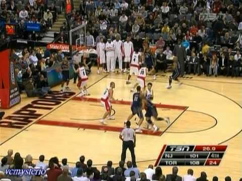

Other than getting waffle-stomped{{1}}[[1]]Editor’s note: please don’t look this up on Urban Dictionary[[1]] by the Chicago Bulls on January 6 (predictably and unfortunately), the New Jersey Nets decided to get nostalgic and adopt the look of their ABA predecessors, the New York Nets.
Marked by true red, white, and true blue, the Nets wore their away versions of the uniforms, characterized by the player’s left-side uni-body stripes and stars. Last worn in the 1989-1990 season, the only difference between the ABA and NBA Nets uniforms of the same template was the name of the team on the away jersey; ABA and the early NBA version had “NEW YORK”, and the later NBA version had “NETS” with “NEW JERSEY” moving down the red stripe vertically).
This particular uniform is not the best of the Nets’ looks over the years. I actually favor the 1990-1997 set over these, and I like the original version of the current set that New Jersey currently wears, only I prefer the scoopneck collar, the argyle-hole mesh, and I wish they’d adopted the true blue over instead of the dark navy.
The retro unis are somewhat meaningful because of their history, if you’re sourcing Julius Erving and Buck Williams as the Nets’ history. (Though if you like reminiscing on the losers, Chris Morris and Roy Hinson will provide great memories of career underachievers!)
If nothing else, this temporary “new” look will offer something for fans to look forward to, considering the franchise’s current troubled state.