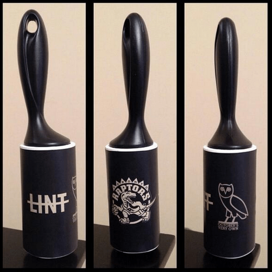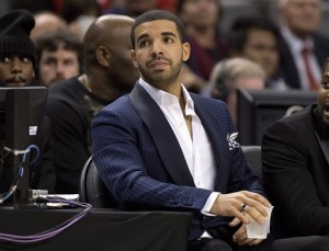
The Brooklyn Nets casually keep a courtside seat warm for Hip Hop royalty. The Toronto Raptors keep a courtside seat open for Drake – so they can plaster his name and likeness on everything. We did in fact, unfortunately, live through Drake night.
But, if The Nets can’t beat ’em on the court (except maybe in the playoffs) they certainly can out-market them. Today, the Toronto Raptors unveiled a new logo that looks eerily similar to The Nets minimalist black-and-white logo. But just as the franchise couldn’t resist marketing Drake night, Toronto added their own corny dash to the logo — scratch marks across the new logo’s all-too-familiar basketball from a set of fierce Raptor claws.

The new logo leaves many questions unanswered: Does the new logo border on copyright infringement? Will The Raptors attempt to co-opt the Nets black and white color scheme for everything? Wouldn’t the Raptor scratches deflate the basketball rendering it useless?
These are questions we leave unanswered as we point to The Nets official Twitter account that said it best:
.@Raptors Looks familiar
— Brooklyn Nets (@BrooklynNets) December 19, 2014