


The NBA Most Improved Player Award is given by a panel of national sportswriters to (duh) the most improved player in the current regular season, as compared to previous regular season outputs from said player. Today the NBA announced that Paul George of the Indiana Pacers won the 2012-13 MIP Award.
But what if there was a Most Improved Player In Season Award, or MIPIS? Instead of comparing a player to his output from the previous season, we would track the player’s progress in the current season. While no Nets player has ever won the NBA’s Most Improved Player Award as a member of the franchise, point guard Deron Williams would run away with 2012-13 NBA MIPIS honors.
Williams has not only been the most improved player, he has gone from one of the most overrated players in the league in the first half to arguably one of the best players in the Association post All-Star break. But don’t believe me — a biased observer — believe the cold and objective analysis of my friend statistics.
On Instagram, the NBA posted a pic congratulating George on his win, along with some bar graphs comparing his 2011-12 production to his 2012-13 output. Figures and graphs are a great way to simplify and visually represent stats. Who isn’t impressed when you see a little blue bar (2) representing George’s double-doubles from 2011-12 next to the soaring white bar of his 23 from 2012-13.
In that spirit, I present to you this D-Will graph, first published by user keagmcG on Reddit, tracking D-Will’s points per game and field goal percentage, month by month from the beginning of the season. If you don’t believe it, go ahead and plug the data in to any stats software yourself, and D-Will’s resurgence will come out just the same.
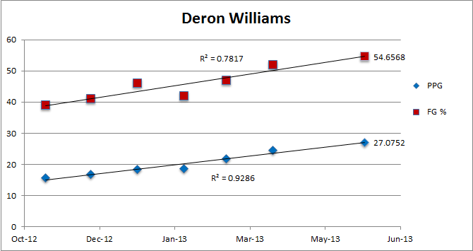
When charting data in this way, the most telling result would be a “linear” relationship between the values on the x-axis (time) and the values on the y-axis (FG% and PPG). That is to say, if you plotted someone’s FG% as a function of time, you could connect all the data points exactly by drawing a straight line through all of them.
The perfect linear fit would have a coefficient of determination, or R-square, of 1. But real world data is almost never that simple, so you are looking for an R-square of close to 1 as possible. In D-Will’s case, his PPGs has an excellent R-square of .9286 and his FG% has a still stellar 0.7817 R-Square.
There’s a whole wonky discussion at this point about what variables to use, model fit and “correlation does not imply causation” etc., but just LOOK at the data. The line goes up. D-Will got healthier and then D-Will got better. Whether it was because he had more lift on his shot, he was able to get to the rim more easily , because he didn’t feel like death after every game in the later half of the season, or all or none of these, is a whole separate discussion. But, again, the line goes up.
The timing of making this point is not ideal, as Williams put up 8 points on 1-9 shooting against the Bulls in Game 2 of the first round of the playoffs Monday night. But that came at the heels of a 22 point, 9-15 shooting performance in the Nets blowout of the Bulls in Game 1. That’s why we don’t do statistical analyses of small sample sizes. It is hard to see the forest through the trees.
Deron Williams found his way through the forest of the 2012-13 regular season to earn our made-up MIPIS award. Congrats D-Will. Now that appropriate praise for D-Will’s regular season performance has been given, I return you to your regularly scheduled programming of obsessing over small sample sizes and Game 3. Because hey, it’s the freaking playoffs.