Hey, at least something’s nice to look at at Barclays Center.
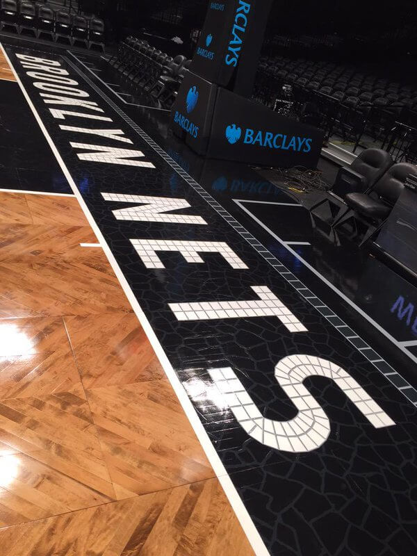
Sports Illustrated took their hand at ranking the visual aesthetics of all 30 NBA basketball courts, and lo and behold, the Brooklyn Nets’ court ended up atop their list, thanks to the originality of the herringbone wood design and old subway station-style lettering on the baseline.
SI’s description:
It is one thing to be different, but it is quite another to do different well. The black and white doesn’t disappoint, with a black frame and black key merging with white lines and the black-and-white center logo in a modest size. Brooklyn, using differing grades of maple positioned angularly, created a herringbone pattern across the whole of the floor. The 2015 addition topped it all off by using “subway art” to create the lettering of “Brooklyn Nets” on each baseline. Perfect originality.
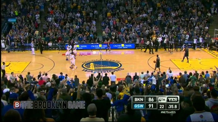
Rounding out the top five are the Milwaukee Bucks (take that, Jason Kidd!), the Boston Celtics (take that, future draft picks!), the Golden State Warriors (take that… Shaun Livingston?), and the Toronto Raptors (take that, Masai Ujiri!).
