A decade in the making, we’re finally here, finally the Brooklyn Nets, finally with an official logo to be proud of.
But are we proud of it?
I’m pleased to say that joining Mark, DV, Chris, and Sandy in our breakdown of today’s branding release is Paul Lukas, the founder & leader of Uni Watch. Uni Watch is “the sports world’s foremost (okay, only) column devoted to uniform design.” Paul’s work has appeared in The New York Times, GQ, Fortune, Gourmet, Saveur, the Wall Street Journal, ESPN The Magazine, Spin, and The Financial Times, among many other publications. He currently works as a columnist for ESPN.com.
Onward:
1. Thoughts on… the primary Brooklyn Nets logo?
![]()
- Paul Lukas, Uni Watch: Well, you certainly can’t say they overdesigned it. I’m generally a “less is more” kind of guy, but in this case less feels like less. It’s so plain, so generic — seems more like an Old Navy knock-off than an NBA logo. Make that “B” thicker, bolder, louder!
- Mark Ginocchio: A nice throwback to the most recent Nets logo so it’s not a total dramatic identity shift for people. Also, Brooklyn is also known as Kings County, and shields protect the King and the Nets protect Brooklyn … or something. It works for me either way.
- Dennis Velasco: I dig the shield logo a lot. But, I also played Dungeons and Dragons when I was a teenager, so that may be an influence there. In all seriousness, the shield makes me think of protection and mostly defending because of the knight allusion and that’s cool with me. It’s all about pride and perseverance, at least symbolically. Hopefully, it shows on the court with defense and a relentless motor on the part of the players.
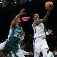
- Chris Hooker: Simple, elegant, almost a throwback of the old New Jersey Nets logo by keeping the shape and basketball. Jay-Z is going to look awesome wearing this logo on a fitted during the next Watch the Throne tour.
- Sandy Dover: Shields are getting passe, but the standard black and white sells it just enough to be okay.
2. The secondary Brooklyn Nets logo?
![]()
- PL: Perfectly tasteful, perfectly fine, perfectly characterless. There’s nothing wrong with it, but there’s nothing special about it either.
- MG: Again, nice throwback to the Nets logos of yesteryear. Obviously the old ABA Nets utilized the basketball as part of their logo quite well and this works for me in the modern context.
- DV: I love it. I can definitely see that popping off and being quite popular amongst the Nets faithful. It’s so simple a design that it’s cleaner and more appealing to me.
- CH: I immediately thought back to the Yankees logo as a symbol of New York City as what this logo could do for the team. It’s just so cool looking. I’ve been reading on the interwebs some criticism of the inclusion of “New York” at the bottom of the circle because Brooklynites consider themselves from Brooklyn, not New York City. However, if the Nets expect to brand themselves out of just a single borough, repping the state as a whole is the way to do this.
- SD: The ball logo, while muted, doesn’t overextend itself with graphics or anything like that. It’s just a ball with a big B. That’s serviceable and good.
3. The color scheme?

- PL: Props to the Nets for having the guts to go with a straight black-and-white color scheme. It can work — but I don’t think it’s working here. Adding just a little bit of silver or gray trim would add a lot of depth. Just ask the Spurs.
- MG: Probably the most radical departure from the Nets old identity as you can’t get any more stark that black and white. But it’s also quite classic and traditional. Maybe the better throwback would have been Dodger blue, but the Wilpons don’t own the Nets so I wouldn’t expect that homage.
- DV: Black and white is interesting. I thought a third color around the trim of the logo would be added, but nope, simple black and white. I dig that, actually. Again, simplicity rocks. I don’t mind the nixing of the red, white, and blue color scheme because the Nets basically had to go a totally different route in order “reboot.”
- CH: When I think back to the Brooklyn Dodgers, these colors immediately come to mind. I think about watching old game footage in black and white. I think about Jackie Robinson and the racial boundaries he crossed playing in Brooklyn. I think about the smokey past of the working man in New York City during that time period. Black and white is more than just a color scheme, it’s a historical tribute. And it works.
- SD: I suspect that gray will end up as a third jersey, but black and white okay. It’s also possible that royal and red will come in on a heritage uniform (I’m suspecting) in the future, but as long as they don’t adopt silver like the Spurs, it’s good.
4. The t-shirts/hoodies/hats/gear/etc.?

- PL: I don’t care so much about the merch (I’m more interested in what the players wear), but I’ll say this: The new adidas T-shirt that shows the Nets logo wearing a backwards adidas baseball cap is setting some kind of meta-merch record.
- MG: Love the first few designs that I see. My only complaint is some attire for the infant-sized Nets fan (how else am I going to convert my kid at an early age?). What I love most of all is how prominent “Brooklyn” is in all of the shirts. They’re really going for broke trying to capitalize on Brooklyn pride. I think it’ll work.
- DV: I love everything. Even the ones that don’t even mention the Nets at all. Okay, I’m lying. I hate the shirt with the basketball and the turned cap on top of it. It reminds me of the shirts and style I used to rock when I was growing up in the late 80s when I was acting a fool. I like to call that time period, “My Stupid Years.”
- CH: They simply look damn cool. I can’t wait to rock one of these fitteds and T’s. Finally, the Brooklyn brand gives the Nets some interesting variety to the wardrobe and maybe we won’t see an arena full of those lame Nets “N” hats. These are going to be hats people will buy because they like the design over the team. For once, I am okay with this.
- SD: It’s straight-up and not overly festive, thank God. A real fan will wear black and white and not have any qualms about color.
5. Overall impression of the marketing effort?

- PL: Here’s the thing: The uniforms haven’t been unveiled yet, but I’ve seen them (sorry, not allowed to describe them), and I think they’re better than the logos. So I’d say the best is yet to come for this marketing campaign.
- MG: Despite the early leaks on the internet, I think the Nets rolled this out perfectly. There’s a lot to celebrate here and considering they’re battling the Knicks and Heat series, they needed to do something “big” enough to garner media attention. The playfulness of the web site before the reveal Monday morning was a lot of fun, and the fact that I go to brooklynnets.com and see a black-and-white visual of the Brooklyn Bridge is just fantastic. While I still think the product on the floor will draw fans better than anything else, the careful marketing going into this endeavor has not gone unnoticed by me.
- DV: It’s very Brooklyn-centric, but I think it has to be. The Nets are trying to build a fanbase and it’s all going to start in the borough that houses them. They need that homecourt advantage, so what better way to build that than to cater to Brooklyn.
- CH: Definitely a little disappointed the logos and videos leaked early, especially because it appears much of the blame can be put on lazy security. The videos are totally awesome and are getting me pretty psyched, but they would have been so much cooler if everything just dropped this morning. Even putting out the #HelloBrooklyn shield after Monday’s game ruined the color scheme early. I liked everything they have done so far, marketing almost makes people forget what team is actually going to the Barclay’s Center. I just wish it was all dropped at once.
- SD: I like the overall scheme of the Nets’ look. It’s basic, yet powerful. Bold, yet understated. It speaks to heritage without getting overly nostalgic and it speaks to modernity without having to get all “Jetsons” on people. It’s simply New York.